A look under the hood
UI Elements
The Project:
UX/UI Components & Design Systems is a look under the hood at the building blocks behind the interfaces I design, organized into three families: components, bars, and charts. This page exists because the polish in a final screen is only ever as strong as the system underneath it, and that system rarely gets shown.
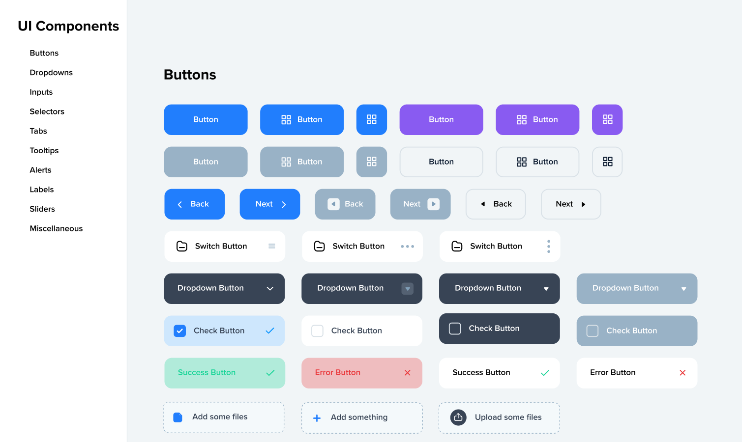
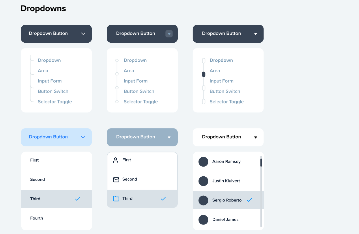
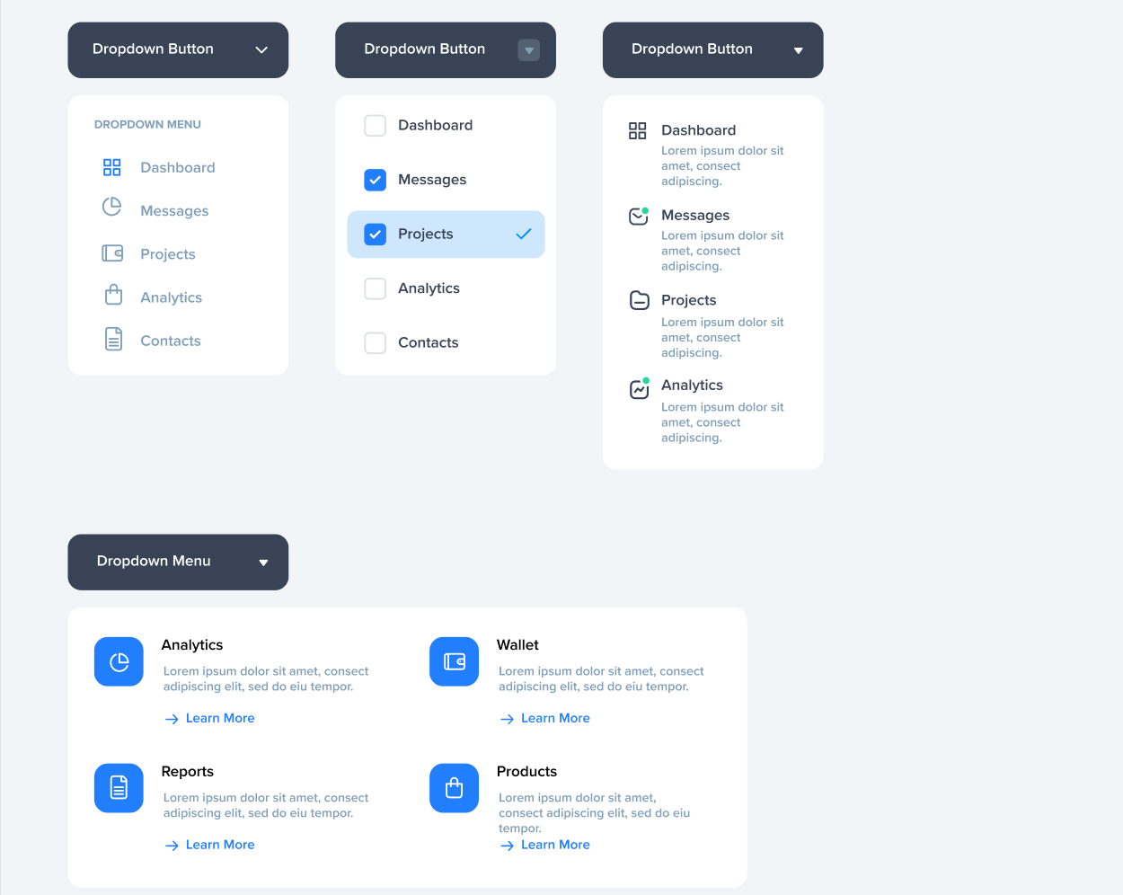
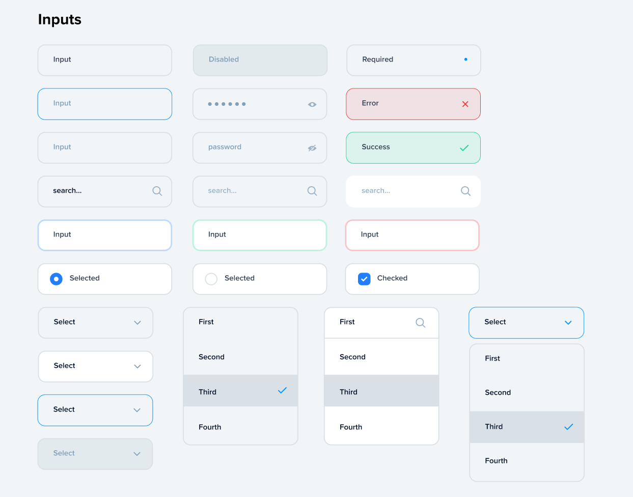
Components covers the smallest, most-used pieces of any interface: buttons, dropdowns, inputs, sliders, alerts, tooltips. Every one is built to answer a specific question first: what does the user need to notice, what state is this element in, and how does it behave when something goes wrong. From there I define the visual language, spacing, color logic, and type scale, so each element reads as part of one system rather than a one-off decision.
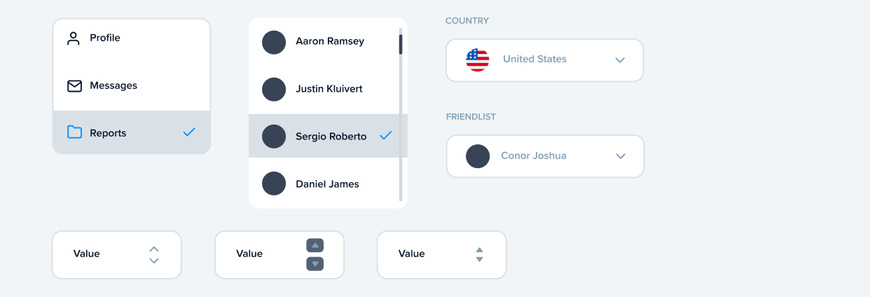
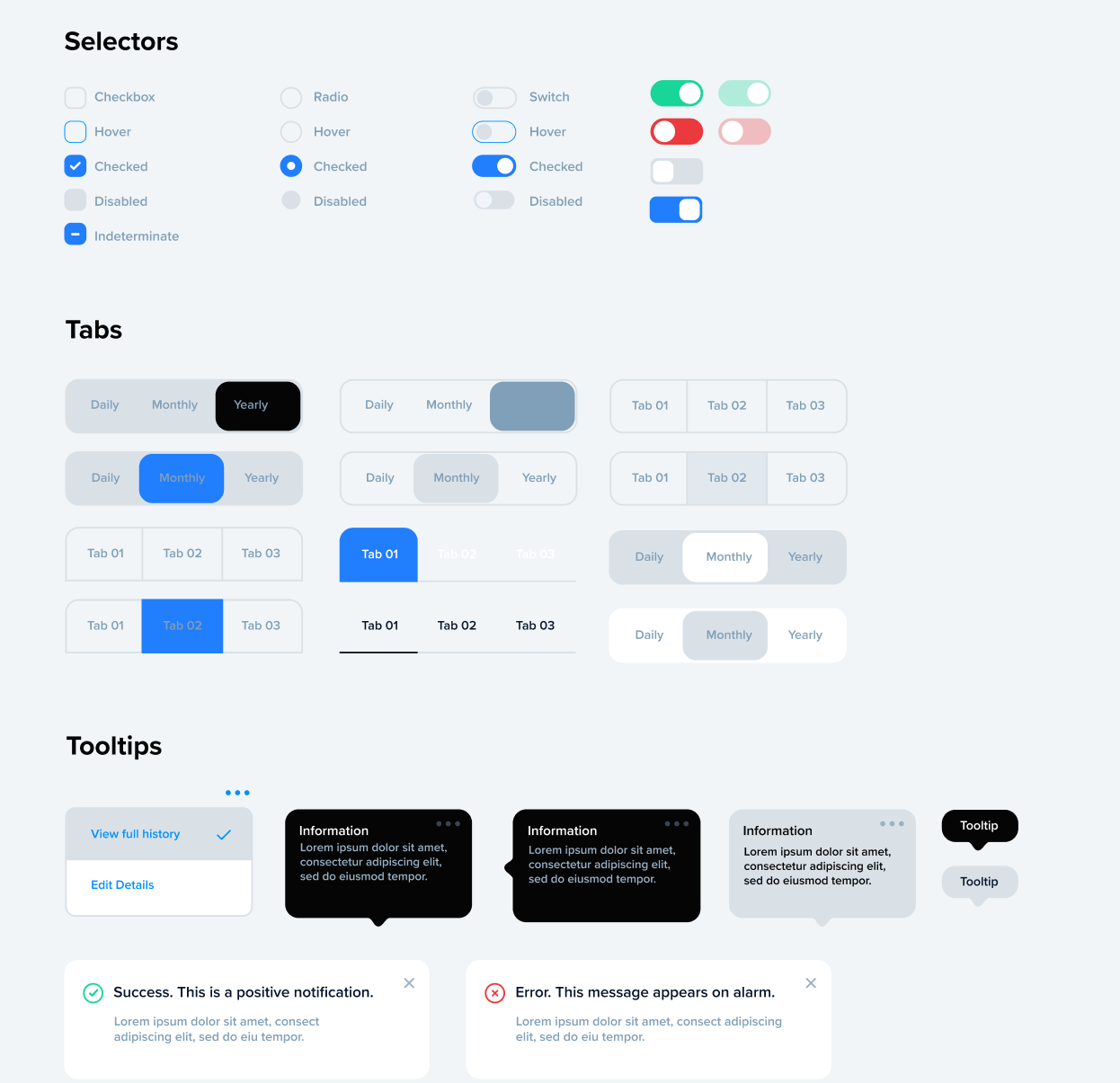
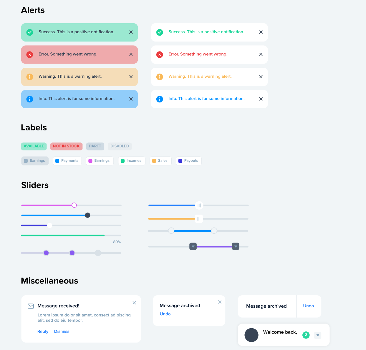
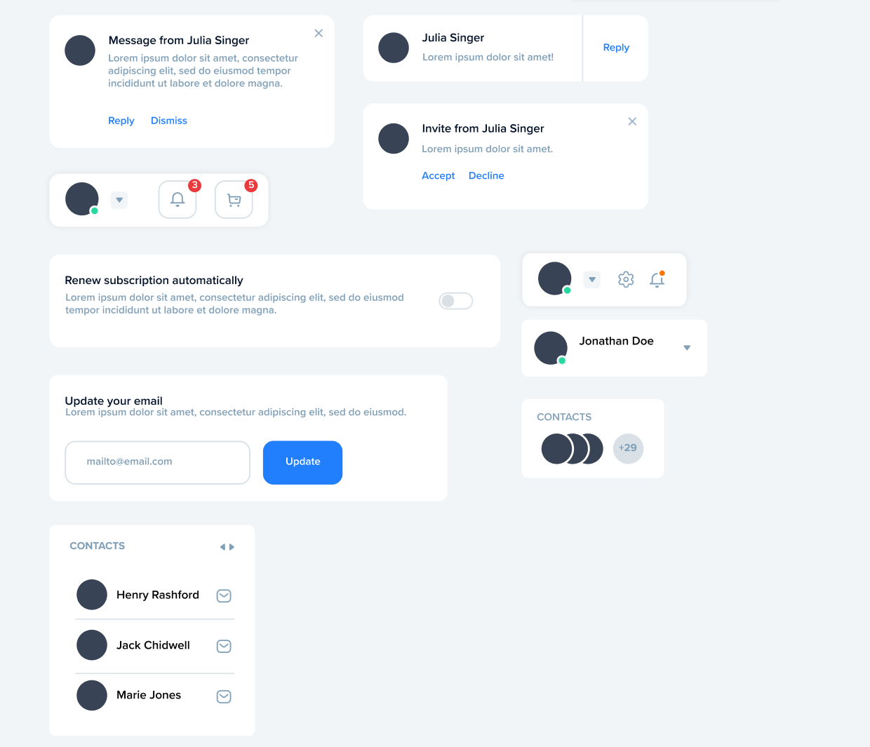
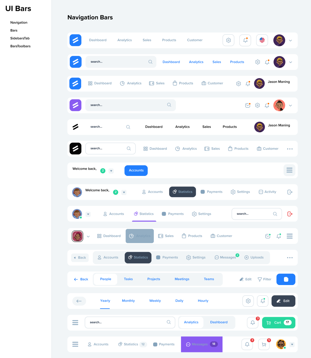
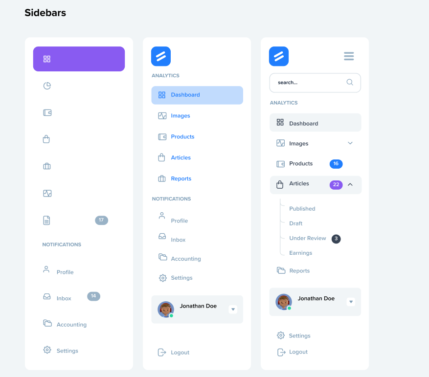
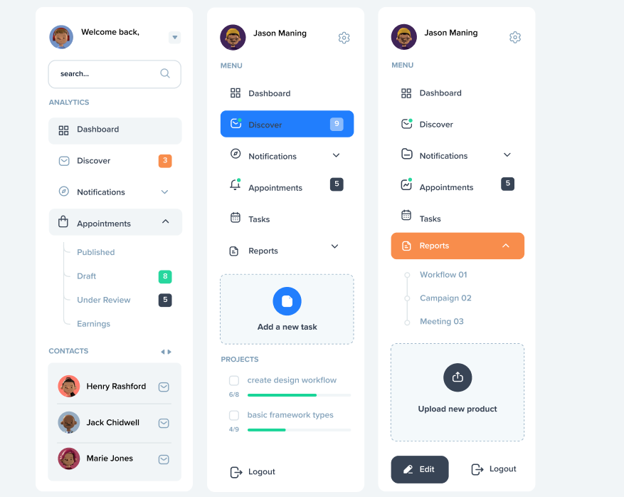
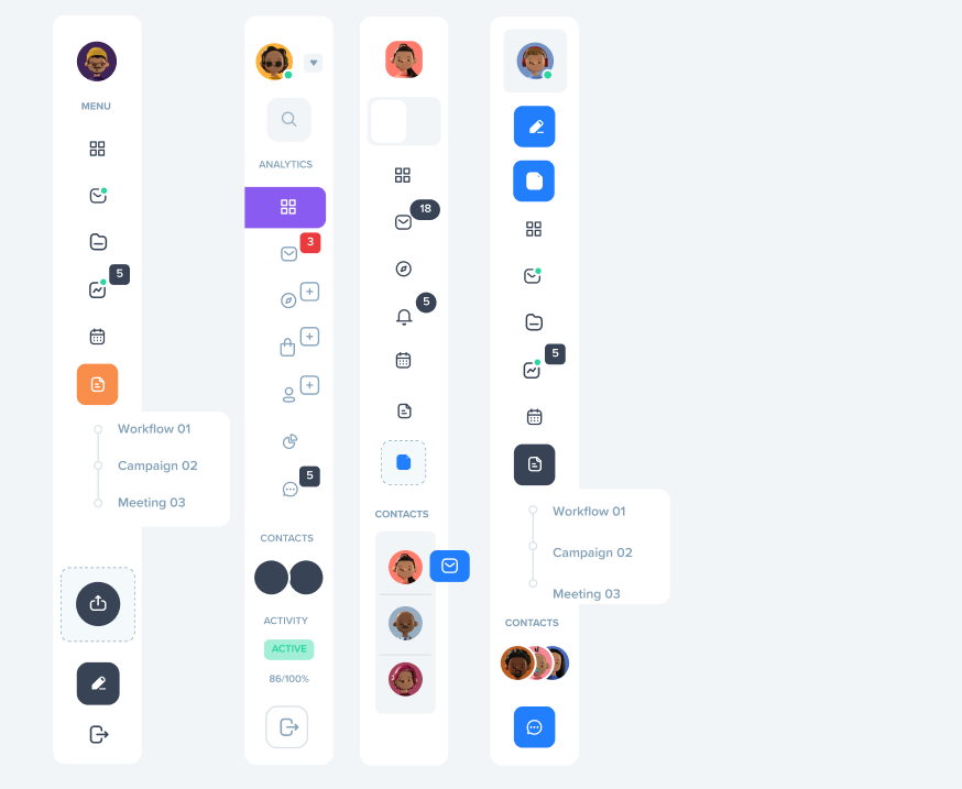
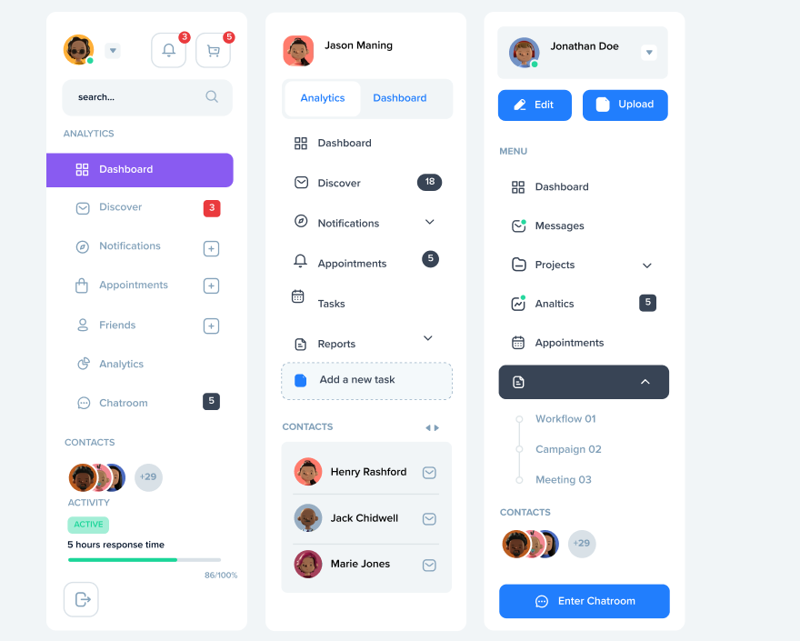
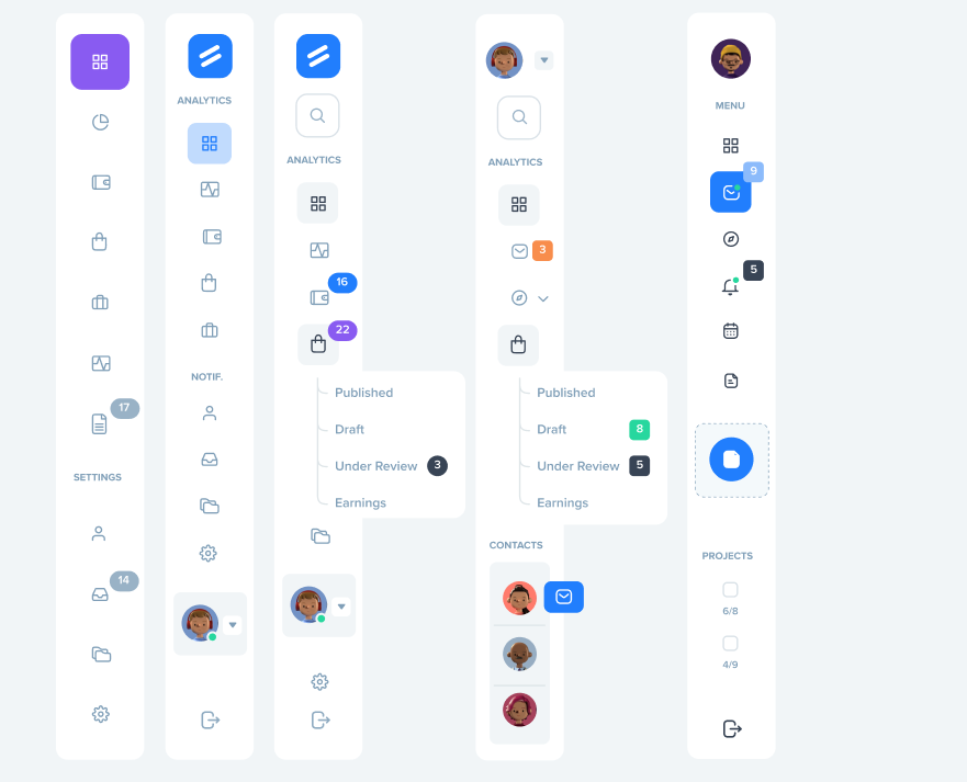
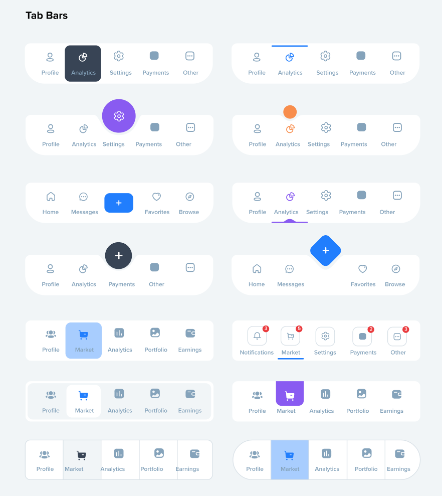
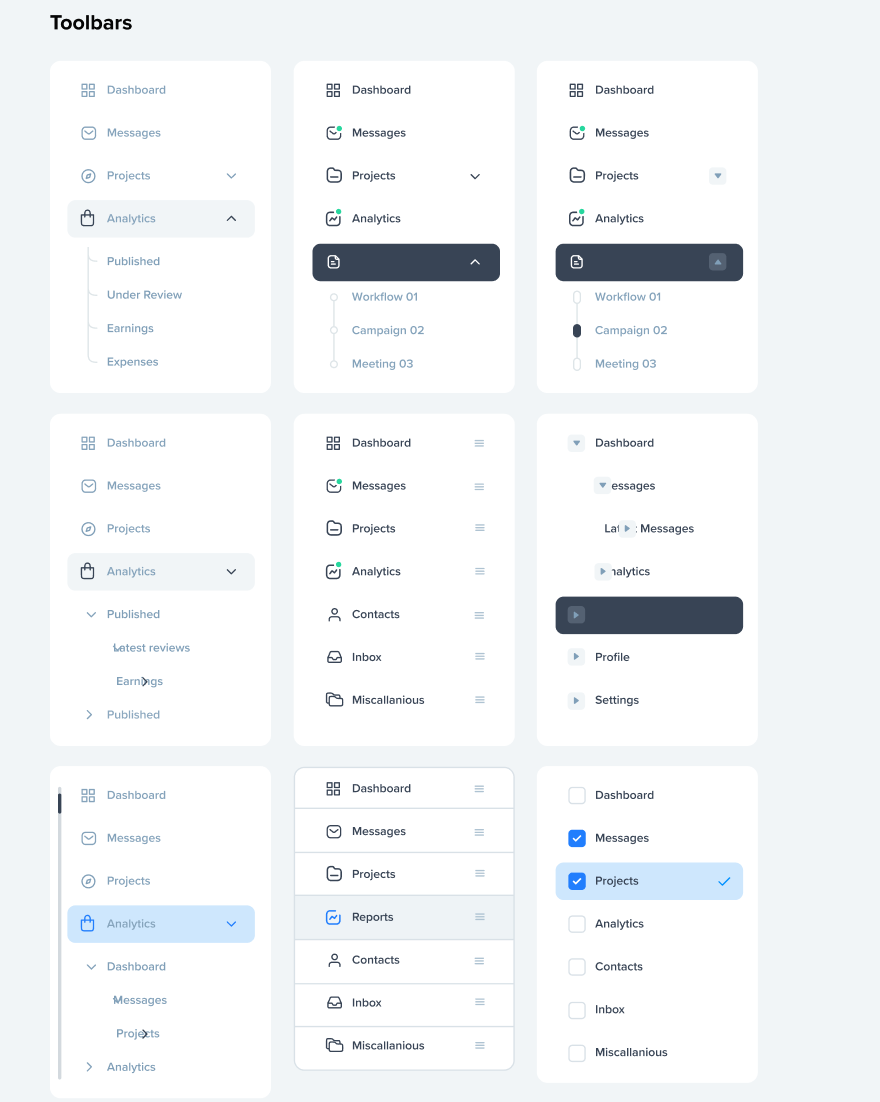
Bars covers the structural navigation of a product: nav bars, sidebar tabs, toolbars. These are the elements a user touches constantly without ever consciously thinking about them, so they get held to the highest standard for clarity and consistency. Every state, active, hover, collapsed, disabled, is designed with the same care as the default view, because navigation that only works at rest isn't finished.
Charts brings the same rigor to data. Clear labeling, accessible color contrast, and a visual hierarchy that lets a user scan a dashboard and know instantly where to look, without needing a legend to decode it.
Across the projects featured here, from SaaS platforms to consumer products, the goal has been the same: build components that are reusable, accessible, and flexible enough to scale with a brand as it grows, without ever losing the small details that make an interface feel considered.
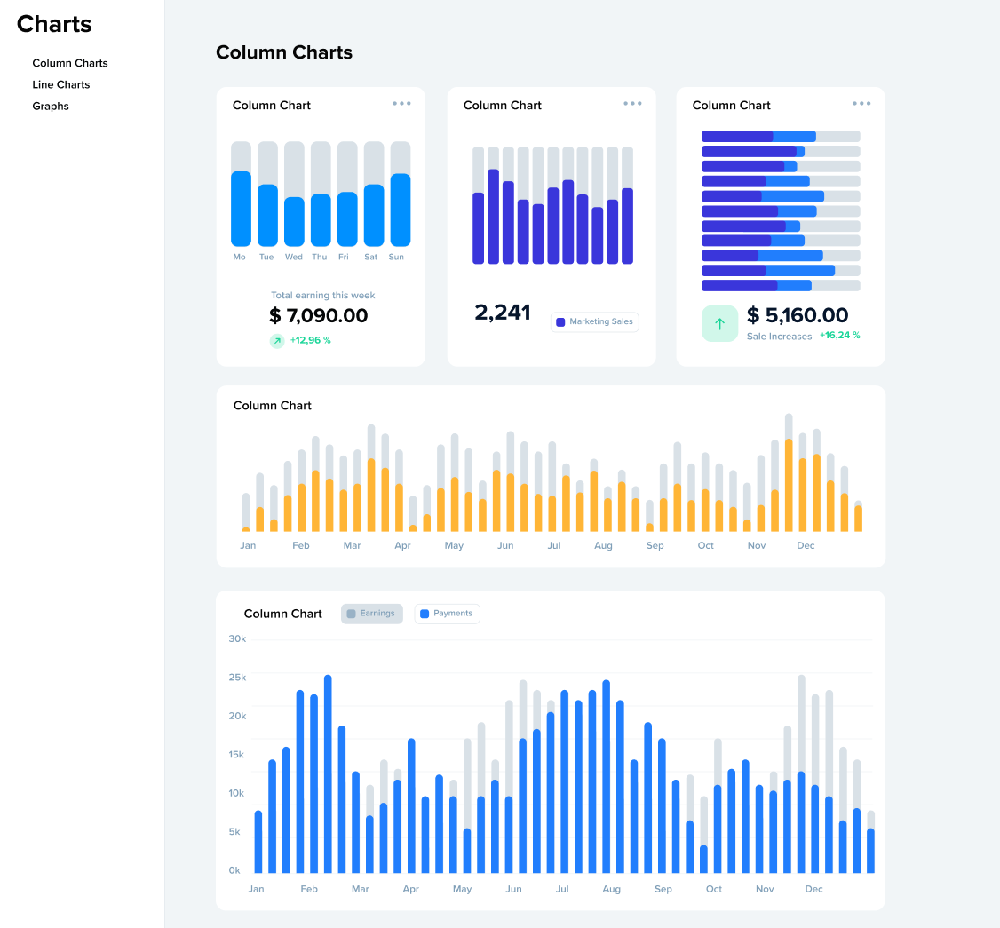
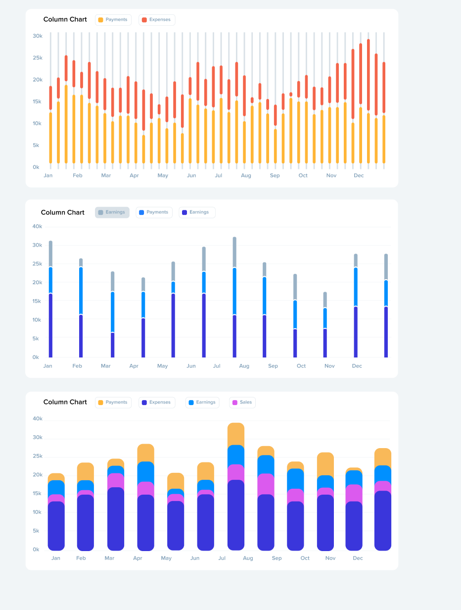
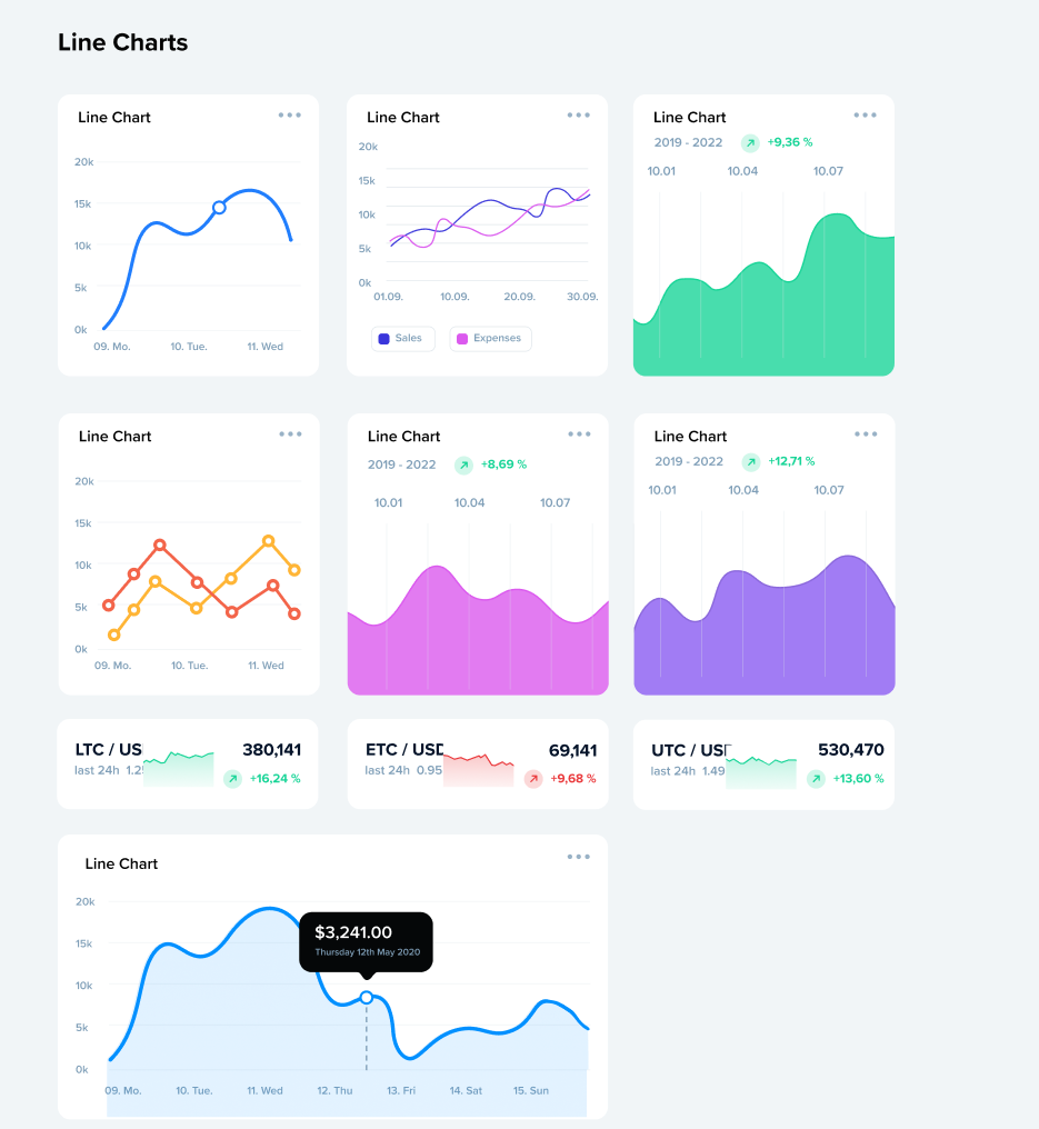
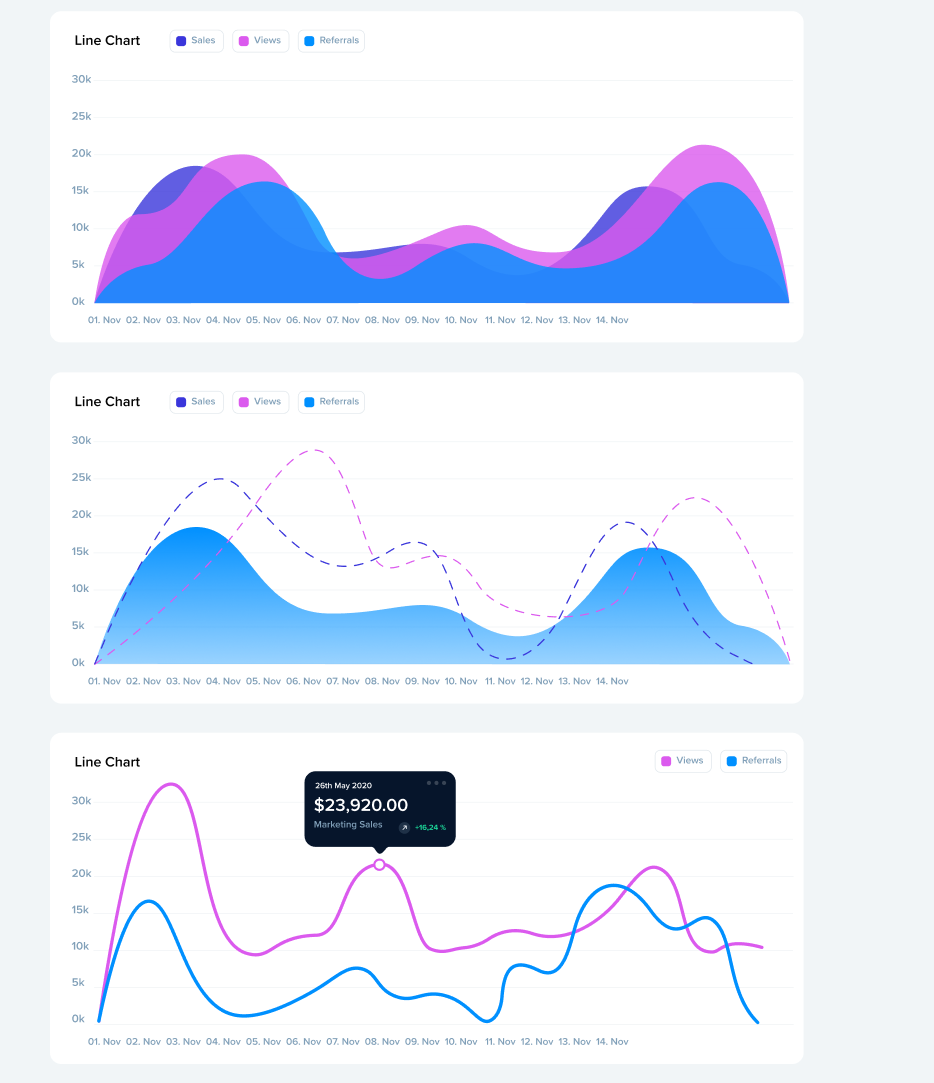
Landing pages are where all three families come together. A strong landing page isn't just a hero image and a call to action, it's components, navigation, and often data or social proof working as one composition to move a visitor toward a decision. I treat these as a proving ground for the system itself: if the buttons, bars, and supporting elements hold up under a real layout with real content pressure, the system works. If they don't, that's where the gaps show.